Technology at your fingertips
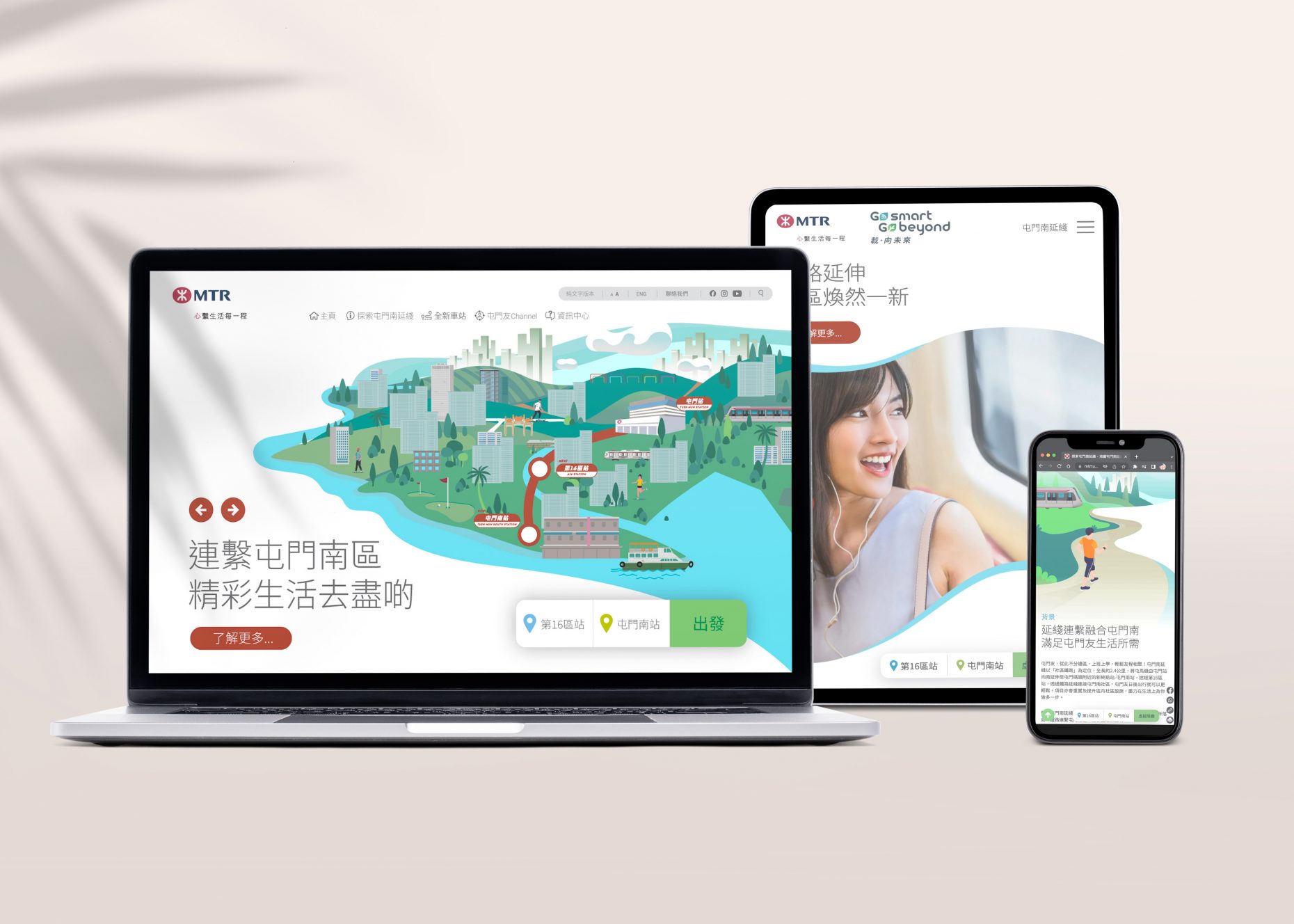
Yooou creates an online experience for MTR shareholders and the public community, updating information about the Tuen Mun South Extension construction project scheduled to begin in 2023 and complete in 2030. They use innovative technology to develop traditional press and newsletter conferences, making online access for all stakeholders fully digital, simplified, and most importantly, simple.
The Brief
Yooou needed an updated website to make it as easy as efficient to engage and convert stakeholders on the Tuen Mun South Extension project. This will involve a structure and some significant modernization – making the user experience more seamless.
We worked closely with the MTR marketing team and partnering digital agencies to create an improved structure for the user journey, making it easier for potential clients to see the information, solutions and technologies most relevant to them.
Approach
We are well aware that MTR often has clear requirements and communicating their messages to their shareholders and niche markets as early as possible will be able to provide more appropriate messages and experiences. We worked closely with the team on their content architecture to set the best map for users to get the information they need – intending to convert them as quickly as possible. This means ensuring that clear messages are provided to users at the right moment and simplifying the richness of information provided by MTR.
Outcome
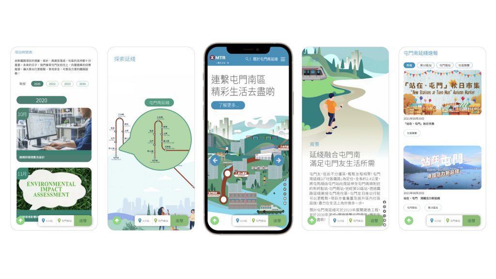
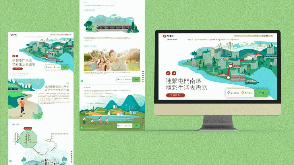
We designed the site with simplicity in mind, using MTR’s unique burgundy colour as the characteristic colour for buttons, hover states, and important functions. This was done against an otherwise muted monochromatic palette, meaning key user journeys became clear and engaging. We developed a design system that consistently uses arrows, highlights, and interactive animations to enhance the user experience and engage potential customers through the natural consumption of subway content.
Consistency across all devices
Optimizing your mobile site is a top priority throughout the process; making sure that elements scale easily to fit smaller devices, and that everything is easily accessible. From the call to action to subtle animations and breaking information into logical digestible sections, the design remains consistent across the site.

