A transportation hub to various attractions
A comprehensive and informative website for local elements engages the residents & thus draws attention to railway development.
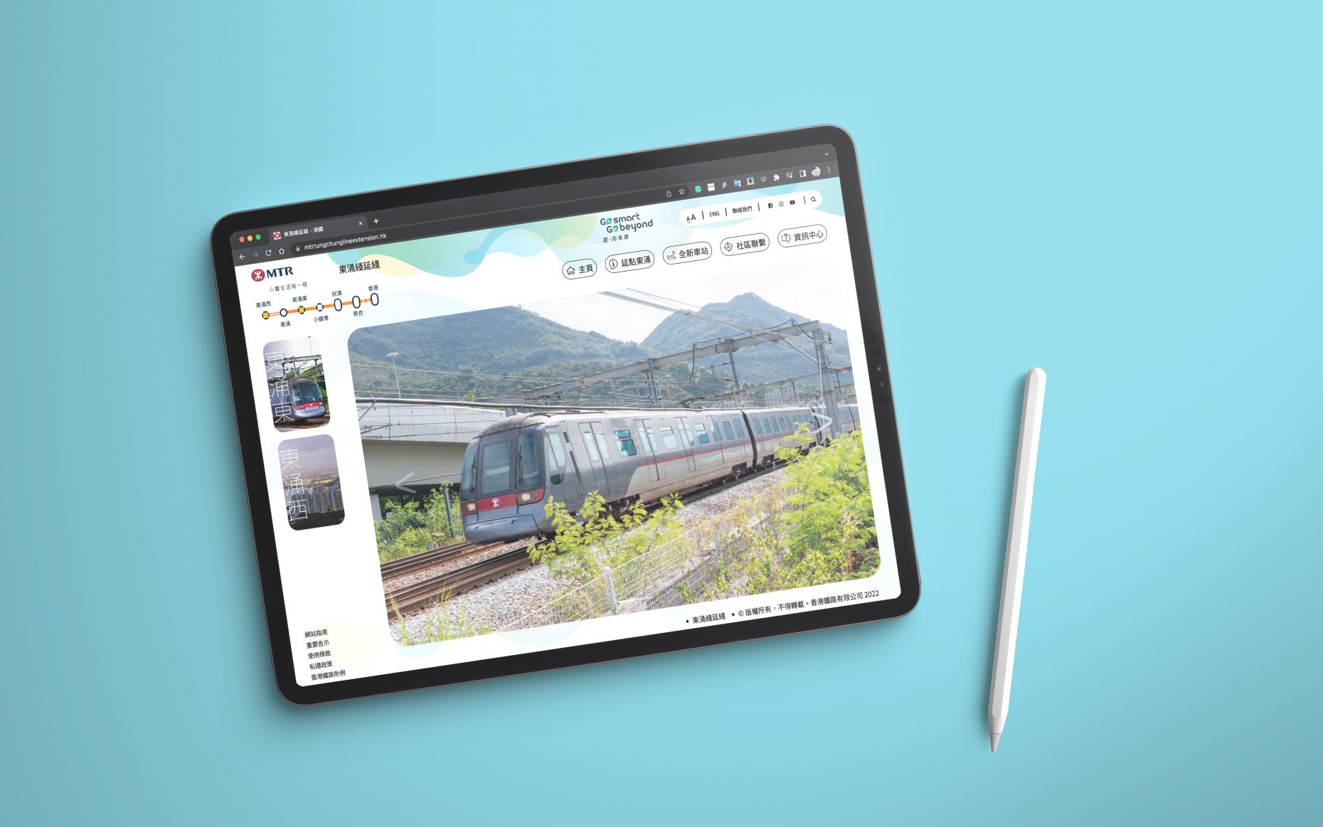
Keeping was engaged to work alongside one of our closest development partners, to design a new website for the MTR – Tung Chung Line Extension.
The Brief
The goal was for local elements to engage the residents and thus draw attention to railway development. To achieve this, we ran various workshops with the local residents and the project team to create a website that challenged the norm, much like MTR pride itself on doing for its passengers.
How can bring them to the attractions quickly and easily? Railway-related information such as progress, station design and how it could create an impact on the environment could be highlighted by communicating the local elements.
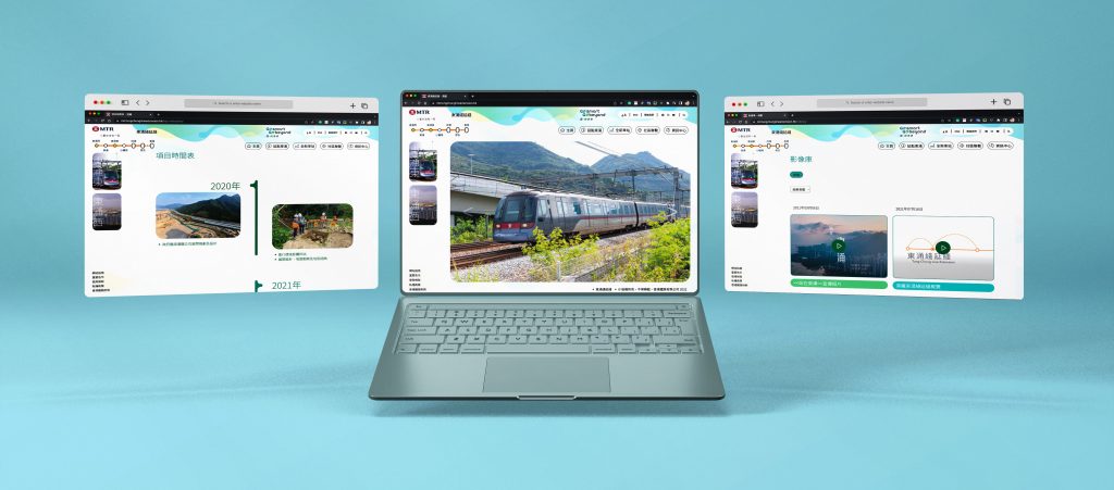
Our Approach
With key methods of ongoing collaboration in place, we worked through numerous iterations of content flow and user journeys, before producing a final set of wireframes.
The wireframes then acted as the guidelines for the concept designs that followed, with A combination of greens and sea view: plain background with green and blue to inject a refreshing impression which pragmatically highlights the sustainable development of TUE.
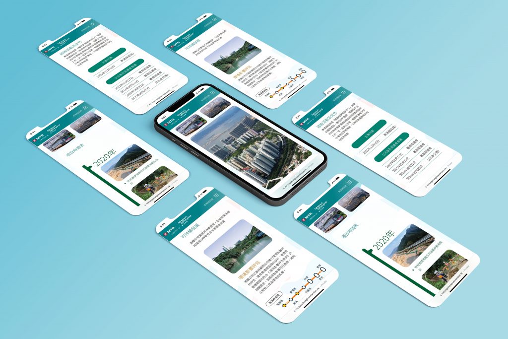
Prioritising Content
As with most websites in MTR, the volume of information that it is necessary to provide a user with is a key challenge. It is important that the website offers a simple user journey, with digestible content, without reducing its relevance.
We produced designs which prioritised key content and made further information easily accessible through familiar tools and interactions, such as tables of contents.

